


We Craft
Reality
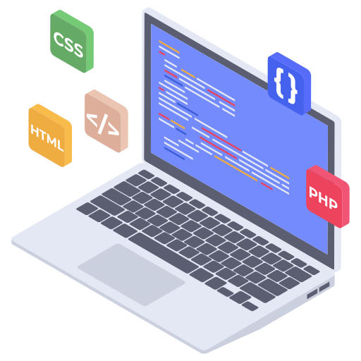
Transforming abstract ideas into pixel-perfect digital experiences for Website, App, Brand Visuals, and Advertising. We engineer visual dominance.
Our Core Capabilities: Brand, Web, App & Advertising
Brand Identity & Visuals
The foundational visual language of your business. Logos, typography, and color systems for lasting impact.
- Core Logo Package
- Detailed Brand Guidelines
Website & App UI/UX
Designing high-conversion landing pages, intuitive e-commerce sites, and seamless mobile application interfaces.
- Custom Web Design (Figma/Sketch)
- Mobile App Prototyping
Advertising & Social Creatives
Scroll-stopping visuals for paid campaigns (Google, Facebook) and organic social media content (Reels, Carousels).
- Performance Ad Creatives
- Motion Graphics for Video Ads
The Elevate Design Flow
We follow a focused, iterative process to ensure every project delivers maximum visual and strategic impact.
1. Discovery & Strategy
Deep dive into your market, audience, and goals. Define project scope and visual direction.
2. Ideation & Concept
Sketching, wireframing, and mood-boarding to generate initial concepts and user flows.
3. High-Fidelity Design
Pixel-perfect execution in Figma/Sketch, prototyping, iteration, and visual refinement.
4. Final Delivery & Handoff
Organized asset delivery, documentation, and support for developer implementation.
The Deep Dive: Design Psychology & Modern Visuals
We leverage foundational principles and cutting-edge techniques to ensure visuals are not only beautiful but cognitively efficient and dynamic.
How Fonts Shape Perception and Hierarchy
The choice of typeface dictates the mood—is your brand serious (Serif), modern (Sans-Serif), or playful (Display)? More critically, font size, weight, and line height establish the *visual hierarchy*, guiding the user's eye instantly to the most important information.
- Readability: Ensuring type is effortless to consume across all devices.
- Grid Systems: Aligning text to a foundational rhythm for consistency.
- Brand Voice: Matching the font personality to the company's ethos.
Visual System: Type Scale Example
H1. The Primary Display Title (Space Grotesk)
H3. Supporting Section Header (Outfit Bold)
P. Body copy is clean, accessible, and sets a professional tone. This is the bulk of the content users will read. We optimize for high contrast and comfortable line length.
Visual System: Brand Color Palette
Driving Emotion and Recognition with Color
Color is the fastest way to communicate brand values. Purple might signal luxury or creativity, while a strong blue implies trust and stability. Our palettes are chosen not for aesthetics alone, but for their psychological impact and functional contrast on a screen.
- Psychology: Using specific hues to influence user behavior (e.g., green for success).
- Accessibility: Ensuring WCAG standards are met for high contrast ratios.
- Brand Equity: Creating an instantly recognizable color signature.
The Structure That Guides the User's Journey
Composition is the blueprint—how elements are arranged in space. We use principles like proximity, alignment, and white space to create a clean, predictable flow. Good composition makes an interface feel intuitive, while poor composition leads to user frustration and high bounce rates.
- Grids: Utilizing 8-point grid systems for consistent spacing.
- White Space: Using negative space strategically to draw focus to key actions (CTAs).
- Flow: Guiding the user through the interface from problem to solution.
Visual System: Action Component
New Leads Generated
2,450
Composition organizes complex data into digestible chunks, reducing cognitive load.
Visual System: Gestalt Law of Proximity
The elements closer together (top row) are perceived as a single group, demonstrating Proximity and Common Region.
The Science of Visual Grouping and Perception
Gestalt principles describe how the human brain automatically organizes visual data into a coherent whole. By mastering laws like **Proximity**, **Similarity**, and **Closure**, we engineer interfaces that are instantly digestible, reducing the effort required for users to understand complex layouts.
- Continuity: Creating flow and direction through strategic alignment.
- Closure: Allowing the brain to fill in gaps, leading to cleaner, more minimalist designs.
- Common Region: Using boundaries (like cards or boxes) to explicitly group related elements.
Using Motion to Delight and Direct Focus
Modern digital design demands movement. Motion graphics provide essential feedback, enhance narrative storytelling, and create delightful micro-interactions. Similarly, realistic 3D renderings and spatial depth are key to product visualization and brand immersion, moving beyond flat 2D designs.
- Feedback: Subtle animations confirming user actions (e.g., button clicks).
- Depth: Utilizing shadows, light, and perspective to give digital elements a physical presence.
- Storytelling: Animated sequences that communicate complex processes or brand history effectively.
Visual System: Motion & Hierarchy
Kinetic Element
Subtle movement grabs attention.
Motion guides the eye and clearly indicates interactivity or a loading state.
Ready to Elevate Your Visual Strategy?
Don't just design—engineer visual dominance. Let's start the conversation about your next project.
Start a Project